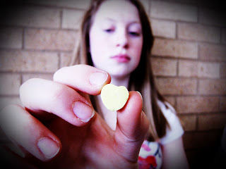
For this photo, I used the Auto White Balance setting to take the original photo. To enhance this photo, I made adjustments using curves and color balance to make colors pop. One thing I think went well with this photo was the way the colors turned out after editing it. Another thing I like about this photo is how the candy heart and hand is in focus, but the rest of the photo is not. Something I didn't like as much was the vignette becuase I think I like the photo more without it and it was a little bit of a challenge to do the vignette right.
For this photo, I also used the Auto White Balance setting for the original photo and then enhanced it using curves, contrast, and color balance. Something I think went well with this photo was how vibrant the colors of the pens are. Something challenging about this photo was getting the colors to be bright, but not too bright and unrealistic.


