For this photo, the light source was to the left side, but not visible in the photo. I used more basic editing techniques such as curves, color balance, and dodging to enhance the photo a little bit. Then I added a lighting effect to make the side the sun was on brighter to emphasize where the light was coming from. Something I liked about this photo was how the lighting effect turned out and how it made the left side of the photo brighter and created a bigger contrast in the background. Something I think didn't go as well was that it was a little challenging to get Nash's face brighter without making the background too light.
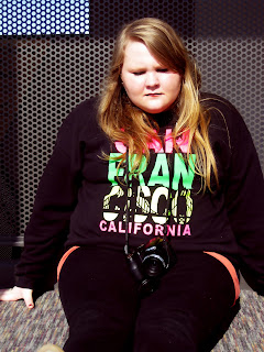
This photo was taken with the light source coming from the front. Again, I used editing techniques such as curves, color balance, etc. to enhance the photo. On this photo I also used spot healing and surface blur in order to smooth out the face, and then painted over some areas with the black brush to enhance areas such as the eyes, hair, and mouth. I really liked how the colors turned out in this photo and how the surface blur turned out. I was surprised at how bright the colors turned out, especially the colors of the sweatshirt, because I thought the sun shining directly on them would maybe wash the colors out a little.

The light in this photo was coming from kind of a 3/4 angle. In addition to using curves, color balance, etc. I put a photo filter on this photo. The color of the filter was a warm orange-ish color to compliment the warm color of the wood and with the photo filter, I preserved the luminosity. Something I like about this photo is the lines of the wall/floor and how it leads to the subject. Something that was a little surprising was how the photo filter didn't make the photo as orange as I thought it would.


No comments:
Post a Comment